
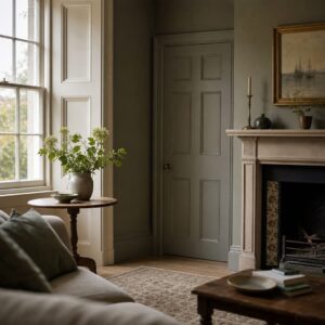
You are standing in a professionally coordinated room. All of the colours, for walls and woodwork and soft furnishings, are chosen from the same 'family' of colours from the same paint company. Everything is technically fine. But there is something slightly wrong. Not wrong enough to point at. Just a faint unease, like a chord that's almost in tune. You find yourself readjusting a cushion that doesn't need readjusting. The room is technically fine, but it is not alive.
There is a reason for this feeling. It goes back further than you might expect.
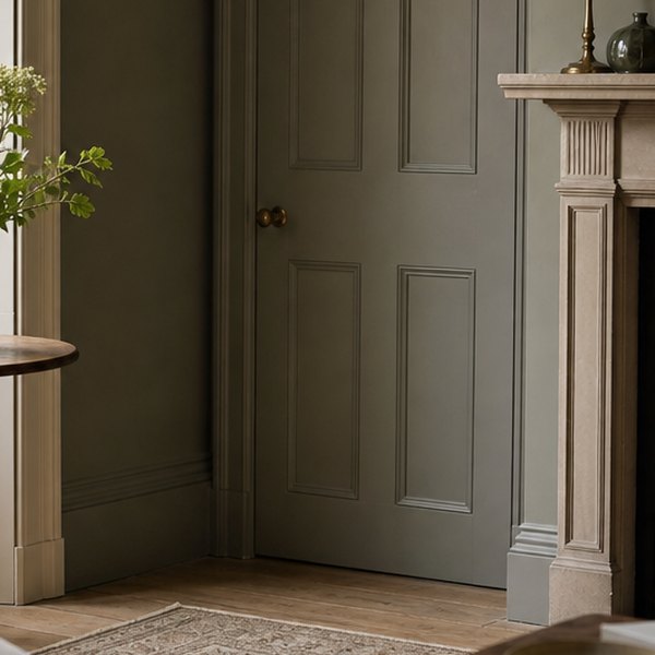
When Reading a Room Was a Trade Skill
A skilled decorator of the nineteenth and early twentieth centuries was not someone who painted walls and ceilings with emulsion and called it a day. As with any trade, painting and decorating had formal apprenticeships, usually seven years. An apprentice decorator learned to ‘read’ colour just as a musician learns to read pitch. Not from a chart, but from a wall.
Knowledge of the craft was specific and oral. A Master decorator would hold two mixed samples next to each other under different lights and ask his apprentice what changed. The samples were held in the morning light from the east window, then in the afternoon light from the west, and in the evening by candlelight. The answer was usually more than the apprentice expected. He would learn that a warm grey that looked very earthy and ‘settled’ in the afternoon light could look cold and even violet in lamplight, and that the fix was a touch of raw umber in the mix, not much, just enough. A white with a blue bias and a white with a yellow bias would look nearly identical on a chip, but fight each other across a room once the ceiling and skirting boards had been painted.
Masters used strange and bodily language about colour in a space. Colours in a space were said to ‘sit’ or ‘belong’ there. A colour that did not work in a space was ‘floating’. You were taught to look at how the colour worked against the timber in the space and whether it pulled the grain forward or pushed it back. The tone of the wood was often the fixed point that all other colours had to agree with.
What the Algorithms Replaced
None of that is how most people choose paint today, and it's not really your fault. Paint companies have made the decision enormously easier — curated palettes, tested combinations, colour consultants on the website. Paint colour chips are arranged by temperature and tone so you're steering rather than mixing. It works well most of the time.
This does not teach you how to see. The old apprenticeship system built a physical, almost muscular, instinct for colour relationships — the kind of thing that lives in the eye rather than on a chart. When that transmission broke down in the latter half of the twentieth century — partly because trade apprenticeships collapsed generally and partly because premixed paint made hand-mixing obsolete — the embodied knowledge went with it. It mostly died with the last generation who held it, and nobody archived it, because it wasn't the sort of thing that archived easily.
For some ideas on how colour and space work together in practice, 5 Living Room Ideas that Put Bifold Doors Front and Centre is worth a look.
How to Recover a Little of the Eye
You don’t have to go back to a seven-year apprenticeship to start getting it back. But you do have to slow down. The modern colour-matching process quietly discourages exactly this.
Holding samples under different lights is a useful old exercise that almost nobody does. Look at your shortlisted chips at 8am and 6pm. Hold them next to the actual floor or the actual timber in the room, not a photo of a similar floor. If you have two whites competing – a ceiling white and a woodwork white – hold a strip of plain paper between them and notice whether there’s a shift. There usually is.
What the masters were really teaching was that colour is not a fixed property of a surface, that there is a relationship between surfaces and that this relationship changes as light moves. The chip in the shop is just a starting point. The room decides the rest.
There is a faint wrongness to a perfectly coordinated room. This usually comes from the colours having been chosen to agree with each other on paper, rather than chosen to agree with the particular light and particular materials of that specific space. The room knows, even if nobody can quite say why.
Questions this raises
- Why do professionally matched colour schemes look flat?
- How do you pick paint colours that work together?
- What changed about colour matching in the 1980s?
- Should woodwork be a different colour from the walls?