
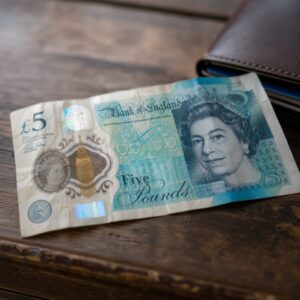
Pull a five-pound note out of your wallet right now. The thing you notice first – before the serial number, before the tiny portrait, before any of it – is the colour. Turquoise-ish, sort of. Green if you're being hasty. Your brain has already filed it under "fiver" before you've consciously looked at it. That's not an accident. That's the whole system.
Britain has been colour-coding its money since the nineteenth century, and for most people it works beautifully. Purple means twenty. Red means fifty. Orange is the one you briefly think might be foreign before remembering it's a ten. The colours do the heavy lifting so you don't have to squint at numbers in a dark pub or rifle through your notes in the rain. Quick, intuitive, completely invisible when it's working.
The trouble is that it only works if your eyes agree on what the colours are.
The Eight-Per-Cent Surcharge Nobody Voted For
Somewhere around 8% of men in Britain are colour-blind to some degree – most commonly with red-green confusion, which makes a lot of purples, reds and greens collapse into the same murky brownish territory. Now look at what the older generation of British banknotes was asking those people to do: tell a brownish ten apart from a brownish twenty, quickly, under pressure, at a market stall with someone waiting behind them. Get it right every single time.
Unsurprisingly, many didn't. And it cost them. Not a dramatic, trackable cost – nobody was scammed outright – but a slow, quiet bleed of small errors. A twenty handed over when you meant to give a ten. Change you couldn't verify. That's not carelessness. That's a design failure landing on the wrong person.
The Bank of England knew this for a long time before it was seriously addressed. For decades, the main concession was that notes were sized differently – a ten was slightly larger than a five – but the sizes were subtle enough to be almost useless in practice, especially for older notes that had been through a few wallets and lost their crisp edges.
How the Design of Money Finally Learned to Speak Twice
The shift came gradually and, it has to be said, partly because people pushed for it. Campaigners and charities representing people with visual impairments spent years arguing that money should be legible to more than one kind of eye. The argument eventually landed. The polymer notes introduced from 2016 onwards brought a combination of changes: more distinct sizing differences between denominations, bold numerals, and – most importantly – a tactile cluster of raised dots in the top left corner of each note. Run your thumb across a current fiver and you can feel them. A ten has a different arrangement; a twenty, different again. The numbers you need are encoded in a language your fingertips can read. No colour required.
This matters for colour-blindness, but it was mostly designed with full visual impairment in mind. For colour-blind users, the most effective change turned out to be something simpler: contrast. The polymer notes use sharper, more distinct hues and better separation between the colours rather than relying on one continuous spectrum of warm tones where everything blurs together.
It's a useful reminder that what looks like a single feature – the colour of a banknote – is actually several different features stitched into one, and that when one thread is pulled, the whole thing needs rethinking.
The Detail-Spotters Who Catch What We Miss
There's something interesting about who notices these small design failures first. It tends to be people who can't rely on the obvious channel – whether that's colour, or sound, or whatever the mainstream version of the system assumes. A child, for instance, who hasn't learned to trust the colour coding yet and is still counting the numbers on the corners, catches things adults have been walking past for years because they're looking at the object itself rather than trusting the shortcut. (For a different kind of detail-spotting that saves money at home, The Best Home Inspector You've Ever Had Is Probably About Four Years Old at perkypad.co.uk is worth a read.)
What Your Wallet Has Already Told You
The history of banknote design is, in a small way, the history of who gets to use money easily and who gets taxed a little by the design every time they open their wallet. The colour was never the point. Quick, reliable recognition was the point, and colour was just the method that happened to suit the majority.
The newer notes do a better job of making that recognition available through more than one sense. They're not perfect, but they're at least asking the right question: designed for whom?
FAQ
How many people in Britain are colour-blind?
Approximately 8% of men in Britain have some degree of colour blindness. The most common form is red-green colour blindness, which results in many purples, reds and greens being seen as various shades of brown and thus merging into each other. This has made it difficult for those men to tell older notes, such as ten and twenty pounds, apart quickly.
What are the raised dots on British banknotes for?
The raised dots at the top left of polymer notes enable users to identify the value of the note by touch. The dots are arranged in a different pattern for each denomination of note – fiver, tenner and twenty. They were largely designed for people with full visual impairment so no colour is needed.
What changed with the polymer banknotes introduced from 2016?
The polymer notes introduced from 2016 onwards added bolder numerals, greater difference in size between different denominations and raised dots for touch. The greatest aid to colour-blind users was contrast: sharper, more distinct colours and a greater separation between colours rather than a long band of warm hues.
Did the size of old banknotes help colour-blind people?
There was not much variation between the older notes in terms of size. While the ten was slightly larger than the five, the difference was not sufficient to be of much use in practice. As the older notes had been passed from wallet to wallet they had become somewhat worn and lost their crisp edges, making the variation in size between them less obvious.